Lesson 1-3
Photoshop Project
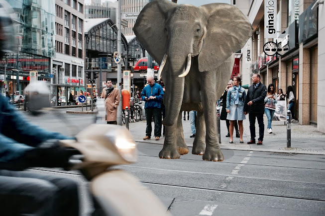
This is a test photo shop project in which I cut out an elephant from another photo and then put onto another image of a street with people. This was done with multiple different techniques and tools like the Quick Selection Tool, the Burn Tool, the Dodge Tool, using a Mask Layer, cutting and pasting, and cropping.
For most of the techniques that were required in this task to develop this project, I couldn't understand, so some parts in making the scene don't look good in my opinion, like the shadow under the elephant. This skill I could improve on.
Photoshop Project 2
This photoshop project was done with the same techniques and use of tools for the project above. In this one, the head of the knight was swopped with the head of another subject from a different photo.
Again, like the last one, some of the things that task was requiring me to do in this project, I couldn't, so there were some small details in the face of the subject the were lacking. But I think that it was bette than the previous one.
Photoshop Project 3
This project was made differently from the last two projects. For the one, the Gradient Tool was used to blend the two images together as shown above.
This project was also made to be a film poster for a romantic film, with the title being reminiscent of a typical love movie.
Compared to the other ones, this one turned out the best that it could have been, I don't think it could have been and better than this result, so for that I think it's alright. I think that the title for it could have been better. I took the title of a an existing movie "When Harry Met Sally" and just tweaked it.
Lesson 4
Poster Research
Poster Options:
Title: Spice
Trope: Big eye
Genre: Crime
Poster Cliches
This thing about the cliches, as described in the article provided, is that the theme of poster designs for films are reused multiple times, as that type of theme and layout of film poster popular and are more likely to draw the viewers attention more. And the viewers recognise from the posters design and elements what type of film it is going to be, wether it is a romantic movie, which the poster will contain two subject, a male and a female, or an action based film, which will likely contain a scene of the subject holding a gun or they have their back to the audience or the poster is showing a dramatic scene of the subject running down a street, or and horror based film which will contain for graphic scenes of blood or it is more ominous and intense with a dark background or a close up sot of an eye.
Poster Choices I Like:
I chose this poster because I like the certain elements in it and the way they are placed, how the simplicity of it is affective and how it all creates a sense of unease for the viewers who look at it. Which is something I want to add to my poster design.
For this poster I was trying to find a something that had more of an action base theme to it, with action elements in it, like the weapon, the pose of the character in the poster, and even the weird feature of a fire streak just about the title, which draws viewers attention among the black and white of the rest of the poster.
I like this poster design for its use of colour placement, with the contrast of the red text in the stark colour of the background, making it stand out more and catching the viewers attention.
I also like this poster for its simple design and placement of features. With the main solemn character making the poster feel normal, but then the placement of the weapon signifies that it is more action and intense based than it seems.
I also like this poster for the same reasons as the others, for its simple yet effective design and how it intrigues viewers. The content of the poster is little but the way its presented makes the viewers think differently about it. With the expression of the characters face making the film seem more action based than the poster comes out to be.
Poster Choices I Dislike:
I particularly didn't like this film poster design because of the displayed subject on the front of the poster. The way it's fabricated is poor. As it's supposed to resemble a skull, which granted the viewers could identify after a while, it is a poor way of representing it. Especially since some of the features of an actual skull are missing.
The only reason I didn't like this poster above all others was the placement of the text on the front of the poster. It feels too crowded and I couldn't focus on the other subjects on the poster, like the man running.
For this poster, although it is in a different language, as displayed above, I could obviously pick out one of the words from the main title, the word "apocalypse". From that, I was confused by the rest of the poster design. Like the Justice is Blind type film poster style with the fish hooks pulling at the subjects skin, it has no correlation with an apocalypse based film.
Lesson 5
Task A
Guardians of the Galaxy Poster Reconstruction:
For this poster design, I had to reconstruct the film poster for the Guardians of the Galaxy film from an existing poster design made by another collage student.
Since this task was not a creation of my own personal design poster, and I was just copying from another source, I don't really have an opinion on it, since I couldn't make it better than it had to be.
Task B
Photoshop Blending Project:
In this project, I was tasked to make a photoshop design using new techniques and styles in which I can blend objects, e.g. water/pool, into other objects, to making them seem realistic, as shown above.
This task involved a whole new set of techniques I was unaware of the photoshop program, all of which are useful and could be used for future projects.
Lesson 6
Quad Film Poster Annotation:
This film poster has a lot of different elements considering the film its advertising for. Its very simplistic in a lot of the components it displays and effective in the same way, with the background design being very ominous and strange and leaving the viewers questioning about the film and what it is about, whilst also displaying all of the other information about the film, like its rewards and of coarse its other primary features; the title, who directed it and the other producers of this film.
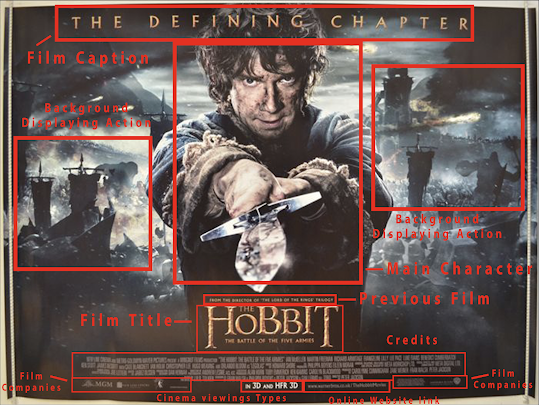
In this film poster, there is a lot of activity and action happening in the background design which is the one thing that is meant to draw the viewers attention, with the dark features in contrast with the light features (of the fire balls). The rest of the information regarding the film occupies a little amount of space on the poster, not really intending on drawing the most attention, but in relativity all of the information about the film is displayed on the poster, like the title, who its made by and of coarse the credits.
For this film poster, it displays a lot of the character and contents of the movie itself, with the character, the antagonists and the protagonists, and isolates some of the locations in the film. The poster doesn't show much information in regards to the film, as in the credits and the producers of the film who don't seem to appear on the poster. But the rest of the features for the film, the title and the cast, are visible for the viewers to see.
Narrative:
For this task, I had to come up with three different story ideas for films, each one with original story concepts and character designs. These ideas will be used to construct a film poster based on these stories as if they were an actual, so all of the characters models and backgrounds used will be taken into account when making the poster. After I gain feedback from another viewer as to which story they think is the best, I will use their idea to focus on which story I will use to make a film poster out of. (see Feedback at the bottom)
For my stories, I tried to make each story as different from each other as possible, taking into account multiple different film genres, like horror, action, sci-fi and drama, to add verity and option for all of them.
Feedback:
The feedback I received for my narrative ideas, which was from my colleague, was that story 1 and 2 were more enjoyable and intriguing than story 3. For the third one, I had created too much random information that didn't make sense for the viewer, and so they didn't enjoy or understand the plot and storyline of what was happening in it as well as the first two, which both gave more description of what was going on in the film and they fit well with their own separate film genre.
My colleague stated that she liked the first two because they automatically reeled her in they interested her the most and made more sense than the third. She said also specifically said that she liked the first story I made, "The Mentalist", because it gave more description about the characters and their background, what their backstories are, how they feel in the film, and what their motivations are, all of which hasn't been done as well for my other stories. So based on this information, I'm going to make my film poster based on the story of my first narrative story idea, The Mentalist.
Lesson 7-8
Colour Scheme:
For this task I had to produce a colour scheme for my film poster, for what colour combinations were going to be used. During this task, I had to experiment with multiple different colours and combination for multiple different options and outcomes for the poster.
Since the base story for film is slightly morbid in some way, with the involvement of an asylum as the background in the story, I thought it would be appropriate to have bleak and dark colours, with a slight tinge of bright colours to add contrast among the darker colours, so it draws the viewers attention.
Pre Production:
Poster Designs
In this task I made three poster designs as options for the certain layout I want for my final poster design. With what goes where on the poster and what the still shot for the posters background will be like.
The main style that I was trying to go for for my poster designs, and what I want my final product to be, was to have a dark and serious background but the contents of the characters and their body language was slightly fun and not so serious as it first makes out to be, kind of like this Guardians of the Galaxy film poster shown above.
Poster Design 1
Poster Design 2
Poster Design 3After the photoshoot, I'll put the photos through photoshop so I can edit in the second character, "Other", by using the skills I had learnt in photoshop in the previous tasks, I will then fully reconstruct the second character with all of his strange demonic features and unique costume design. I will be using the second actor in my photoshoot as a template for the design of the second character.
Stills Shot List
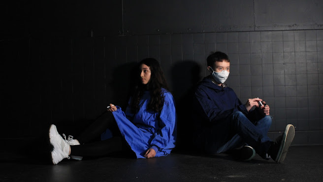
The still shots I want to take for my poster designs involve one with an actor (maybe one of my colleagues) sitting on the floor with her back resting on the wall next to a door, with her smoking a cigarette, acting casual and relaxed. With another actor sitting next to her in the same sort of position trying to light his own cigarette.
Another still shot I can shoot for my poster designs is a close up side shot of the to actors standing back to back of each other, without the background into consideration, as it will probably be photoshopped after the photo shoot.
One last still I could shoot for my poster designs is a side shot of a table in an enclosed room with both actors sitting either side of the table facing each other. One actor in the shot will act nervous, holding herself, while the other on the other side of the table will be acting more confident and care free.
Fonts to be Used
In the video tutorial in the link above, I learned many different styles and techniques of fonts and how different fonts are placed in different places on a page or on a poster, like;
- Typography - which is the layout of the words and letters on a film poster so that they become legible for the viewer and reader.
- Body Copy/Body Text - this is the smaller text parts used in a poster or page to fill in the gaps in which the bigger text does not occupy.
- Display Type - this is used mainly in film posters or book covers. They are particular types of fonts with big features that are made to grab the viewers attention from distance. I will take this technique into consideration when developing my film poster
- Hierarchy - this is where the text on a sheet is arranged from largest to smallest, to direct the viewers attention around the sheet for what they want to see.
- Kerning - this is where the space in-between the letters on a sheet are altered so that they work better on a poster/page, wether they need to by closer together or placed further apart.
- Leading - this techniques is similar to the previous font technique, except this one is where you alter the space in-between lines, above and below them.
I will try and use all of these techniques that I have picked up from the video clip when making my poster design.
Font Sheet
The particular type of typography I want to use for my poster designs is a font that looks normal and average with big bold figures, like the ones shown below, as I think they represent the genre of the film I'm making the poster for. As most of the plot in my film is based around an asylum, I thought that this particular font would be suitable for it, after putting it through photoshop and giving it a sort of rusty effect, which I think will represent the feel of an asylum; its foundation is well built and looks like its made to contain (like the style of the fonts I've chosen), but it also feels creepy and ominous (like the effect I'm going to give it later in development.

I chose the one that looks like its made from a type writer as I thought as an alternative, it can also represent the style of the genre as it would make the viewers think of a sort of report that you would get in an asylum or a hospital, giving information about the patients in there. At least that's what I was thinking when I saw it.
List of Elements for Photography
- Landscape - the area I need for my photoshoot is a small enclosed room with a door in it. Maybe a table with a couple of chairs around it.
- Characters - there will be a maximum of two characters in my photoshoot, one female for the one main character "Ash", who will be sitting on the ground, leaning against a wall smoking a cigarette, the other main character (doesn't matter if its male or female) "Other", who will be resting next to the other character, trying to light a cigarette.
List of Props and Cloths
There won't be very many props used in these photoshoots.
- Props - the props used in this shoot will be fake cigarette in which the actors will pretend they are smoking. And a lighter to go with it.
- Cloths - one after will need to wear a particular set of cloths. This being a sort of dressing gown or something long that covers most of their body, like a typical set of clothes that you would see patients where at a hospital or a mental asylum.
List of Locations
- The locations needed for this photoshoot will be probably be in some unused room somewhere in the collage site.
Recce
Risk Assessment
For the photoshoot of my poster production, I used the studio as it had the appropriate background for the style of my poster designs, it did not have the door on the wall as I had planned for my poster composition but it was the closest landscape I could find that had some of the qualities of the area in which my narrative took place (an asylum), with the dark background and the hard stone features with cobble patterns.
The actors in my photoshoot where the other two members in my group, Natalie Santos, and Scott Alexander.
The lighting in my photoshoot was useful but it could have been arranged better, because one side of the set and the actors where well lit but the other side, the left side, needed more light on my actors. The right side of the actor on the left in the photoshoot (Natalie Santos) was completely blacked out.
Contact sheet
For the photoshoot, I only took a few photos as I was only basing it off one poster design that I had made, taking multiple shots from different angles.
Since basically all of my photos where the same, I had no trouble deciding which one to pick for my poster construction.
Poster Edit:
In the photoshop edit, I extended the length of the background to make the whole photo larger comparison. I was also able to change the colour gradient of the entire photo.
With using particular brush tools and blending methods, and with using a drawing tablet, I draw over the second actors head/face to get the costume design I was planning to have for my poster picture design. A demons head with dark features, horns, and red eyes.
I also added some smoke and light effects for the cigarette props.
I don't remember if we learnt much about how to practically draw on the photoshop (using a drawing tablet) so I can't really compare this costume design to anything else I've done in this task, I was only drawing from my own self experience from drawing other things like this in my own free time. In my opinion, I think it could have looked worse than it is, but I could've also made it look better, with the facial features and the general look of the character design. I know that this is a different kind of take on the sort of project that we were assigned to do, but if we do anything like this in the future, I will remember to take these flaws into account.
Final Poster Design:
For the poster design layout, I tried to give the poster a simple yet effective look with the simple text font and the sort of dry rough effects around it, this effects also kind of adds to the representation of the comparison between the to actors, the black and the white.
Personally, I think there were some elements in in this task that could have been better and some others that I think turned out fine. The layout of the poster design with the text could have been better and could have had more information on it, but this is the second design of my film poster, in the last one when I added to much content on the screen it made the poster look messy and uneven. As said before, the editing on the photograph to reconstruct the actors character could have looked more professional, but I wanted to try something different with making my poster, and besides, I couldn't make a mask or do make up for the actor, my knowledge of that is less than what it is on.
So over all, I think its ok because its simple but its effective, and that's the type of style I want to go for for my future projects.
Evaluation Sheet for Film Poster:




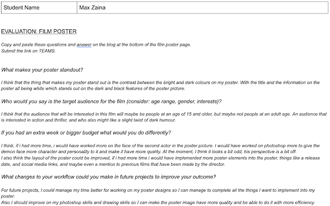

Max great work and very detailed write up for the narrative. I agree with the feedback, it is spot on. You should try and establish your genre - Thriller??? Also to make sure that the girl is shown as a likeable character and not like a mental patient. Props & make-up and the facial expression might help here.
ReplyDelete